Archived decisions
Annex 2 of Appendix 7
RECENT TRENDS IN PENSION FUND ACTIVITIES
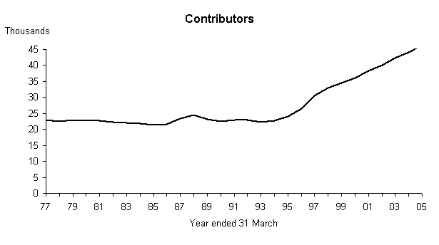
1. Number of Contributors
For the past ten years all part-time recruits have joined the LGPS automatically, whereas previously they only joined if they opted in.
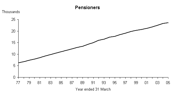
 2. Number of Pensioners
This graph continues to show a remarkably consistent increase in the number of pensioners in the fund.
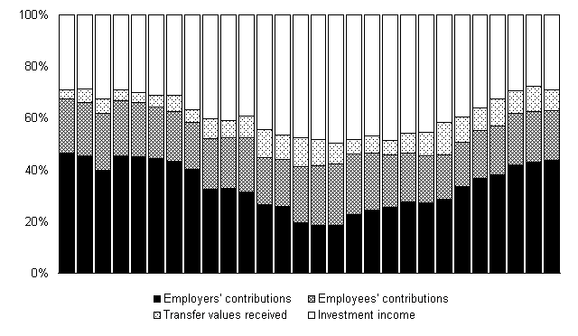
3. Annual Income
These diagrams illustrate the growth of the Fund's income since 1977, together with the split over the four main elements. Income has generally grown steeply in recent years, although it dropped slightly in 2000/01. However it has started to increase again since then as a result of increased employers' contribution rates. 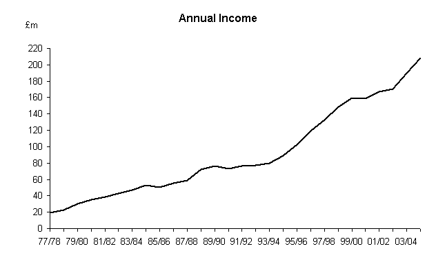
4. Realised and Unrealised Profits
This diagram shows the realised profit and, from 1986/87 when figures are available, unrealised changes in market value. 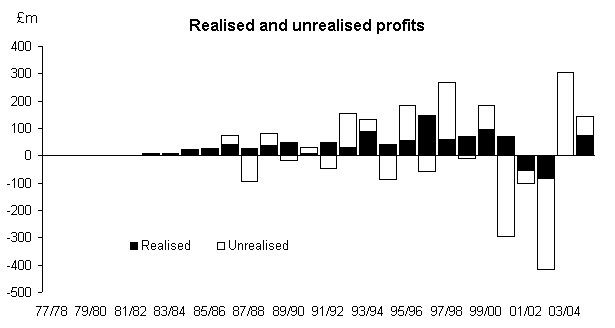
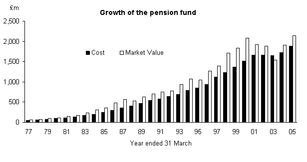
5. Growth of the Pension Fund
Markets have continued to recover in 2004/05 as the diagram below shows.
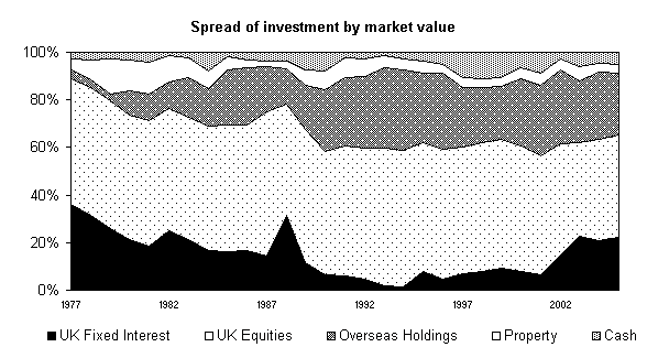
6. Spread of Investment by Market Value
The distribution of the Fund is illustrated in this diagram. The constantly changing picture is partly due to the relative values in different sectors of the market. Nevertheless, major changes are continually being made by positive portfolio management. In this connection it should be borne in mind that a switch of only 1% amounts to £21.4m